
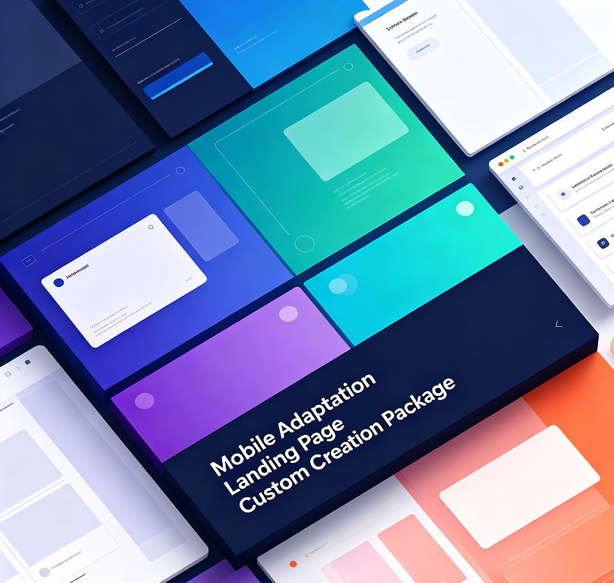


This package is suitable for clients who value phone and tablet browsing experience. The single page adjusts section order, button size, text hierarchy, and image ratios across different screen sizes so European visitors can read smoothly on mobile devices, and uses Stripe deposit payment.
Included are mobile structure planning, button sizes, form fields, image cropping, font hierarchy, basic loading speed improvements, service notes, common questions, contact entry, multi-language switching, cookie notice, and privacy entry. Stripe deposit entry, appointment entry, and subscription entry can be added. Desktop and mobile content can be adjusted separately.
After ordering, a deposit is paid first to start. The exact amount depends on page length, number of languages, adaptation scope, and interactive functions. After requirements are confirmed, production begins. Results can be viewed on different devices during this period. After confirmation, the remaining payment is settled based on actual work before launch delivery. Final adaptation scope is subject to the confirmation form.